A new visual identity for Bristol’s Museum and Art Gallery
A flexible and dynamic visual identity that can communicate with all parts of the Institution's very broad target audience through: an underlying visual language; a liquid logotype; a framework for promotional applications; and proposals for dramatic internal and external environmental applications.
The project included identity design, graphic design, branding, editorial design, and moving image
1
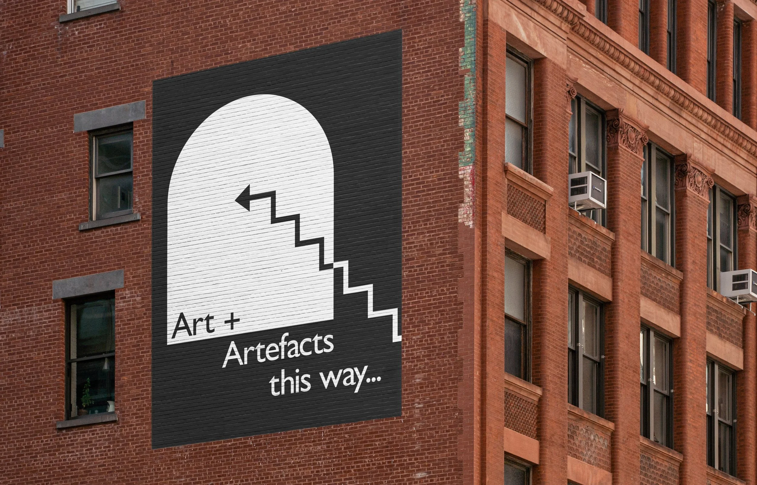
The starting point came from the prominent arches both outside and inside the institution’s building. Simple lines were then drawn from the local environment, forming an abstract map from the harbour, up the famously steep Park Street and onto the building facade.
2
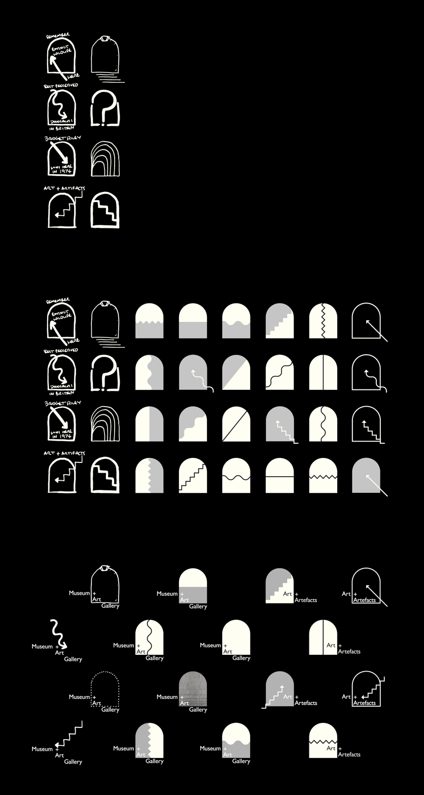
Early sketch visual language experiments were worked into a kit-of-parts using the arch and three varieties of lines rotated through three angles. These can double as arrows for internal signage or citywide directional info.
3
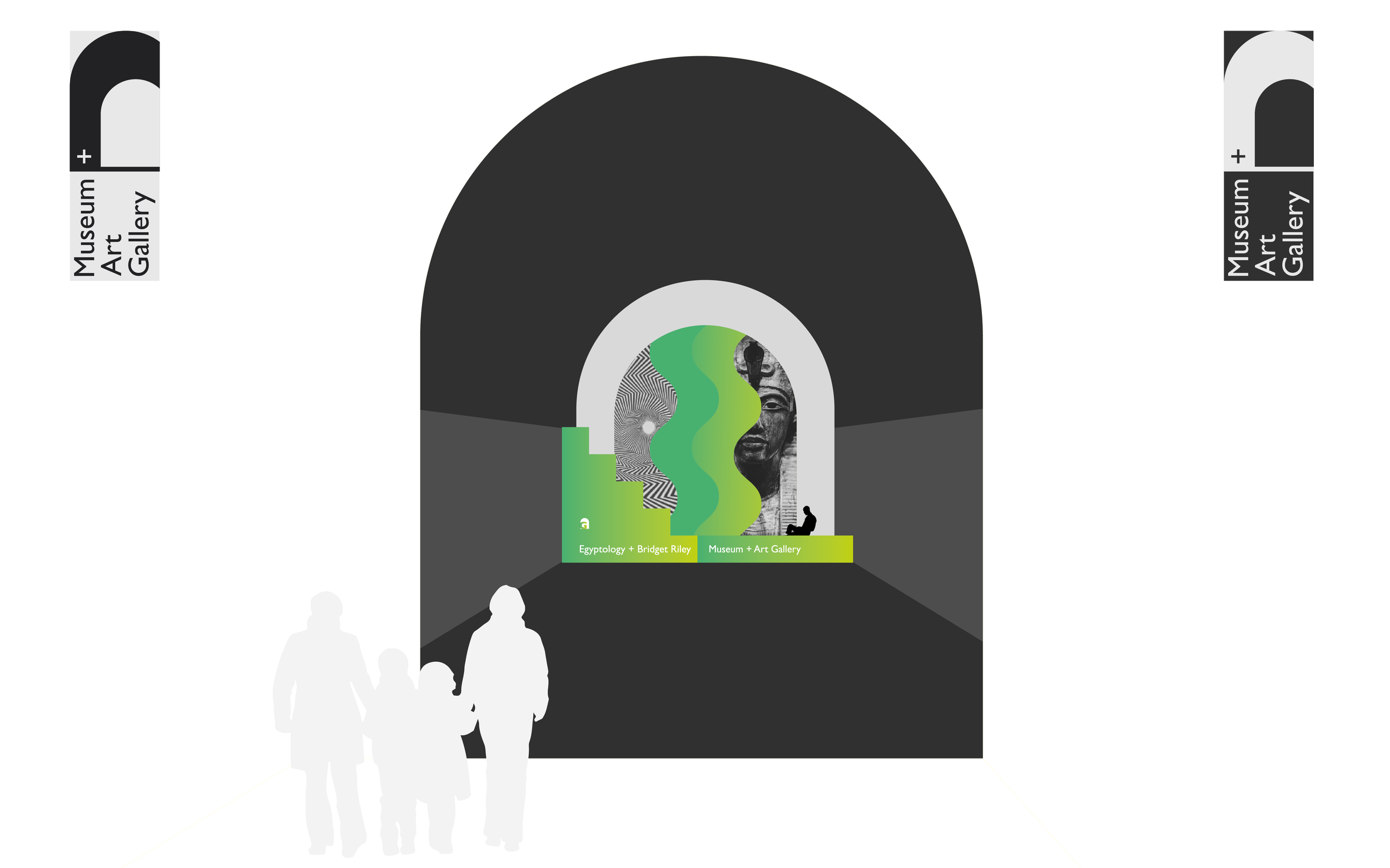
This kit was then developed into a ‘liquid’ logo with typeface chosen for a mix of geometry and calligraphic elements. The arch is anchored so that it can scale infinitely and pivot to contain either the word ‘Museum’ or ‘Art’.
4
For environmental applications, I was keen to allow freedom to reinforce just how diverse the audience and collection is. ‘Art + Artefacts in Bristol’ is used as a tagline so that the city name does not disappear entirely.
5
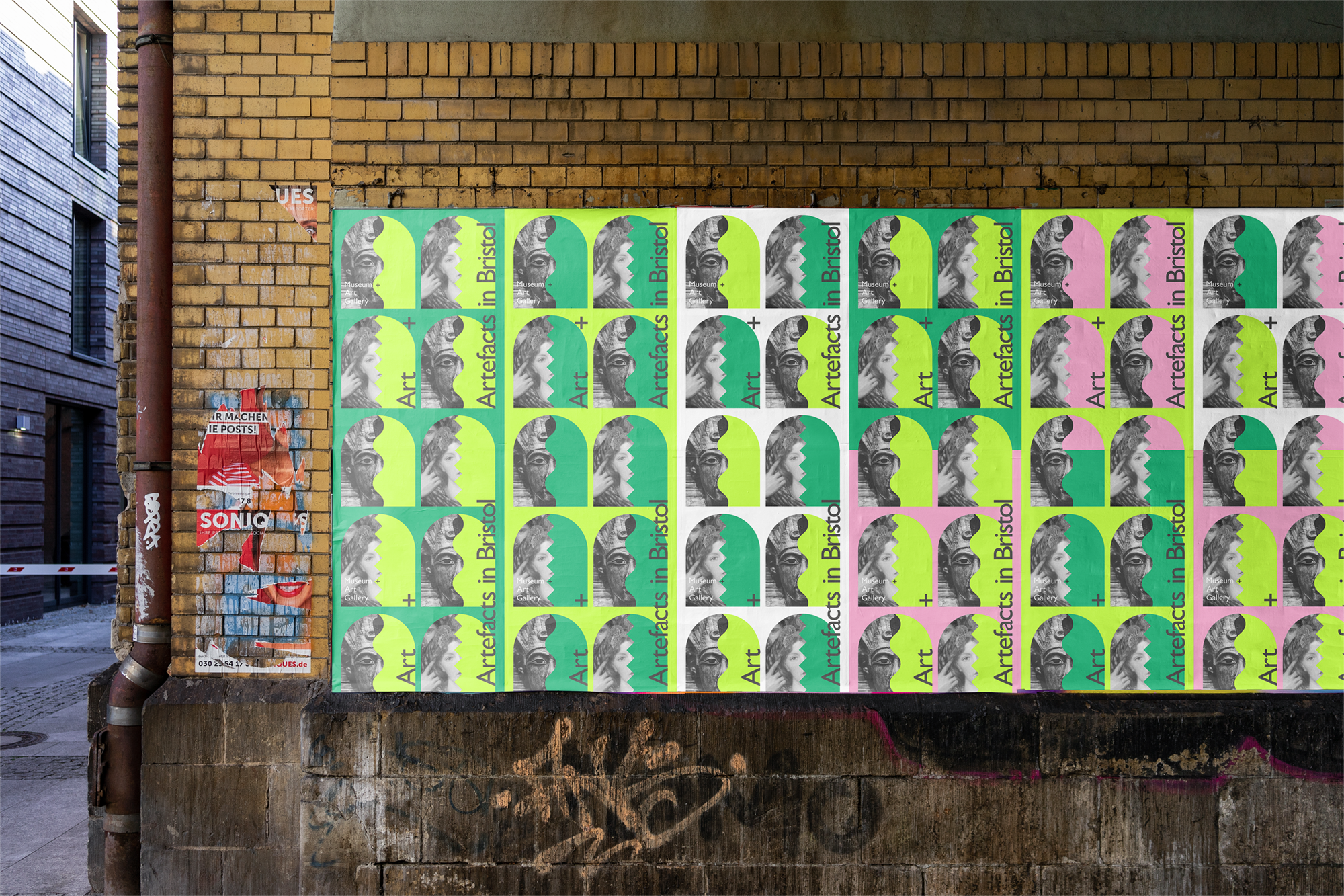
Similar freedom is allowed by a poster system made from a grid that is based on three sizes of the arch, to give some starting points for the day to day designers. A simple small, medium, and large text hierarchy is also provided.
6
The project was finished as a 30 page print format implementation guide and a 10 page E-publication to showcase moving image elements and digital applications.
Video showing the logo as a container
Video showing the flexible elements of the logo
