
An editorial framework for the Nature Finance Review
Ecosystems Knowledge Network, a charity bringing together a network of parties with an interest in the stewardship of land water and nature, required a publication to showcase its annual review of nature finance projects.
The brief included design of the c. 100 page publication, and production of approximately 30 infographics to highlight key statistics.
However, due to the timescale of the project and the limited resources, it was proposed that a template for the report and a system for the charts and diagrams would be designed, so that future iterations of the report would require much less work to produce.
The project included graphic design, and editorial design.
1
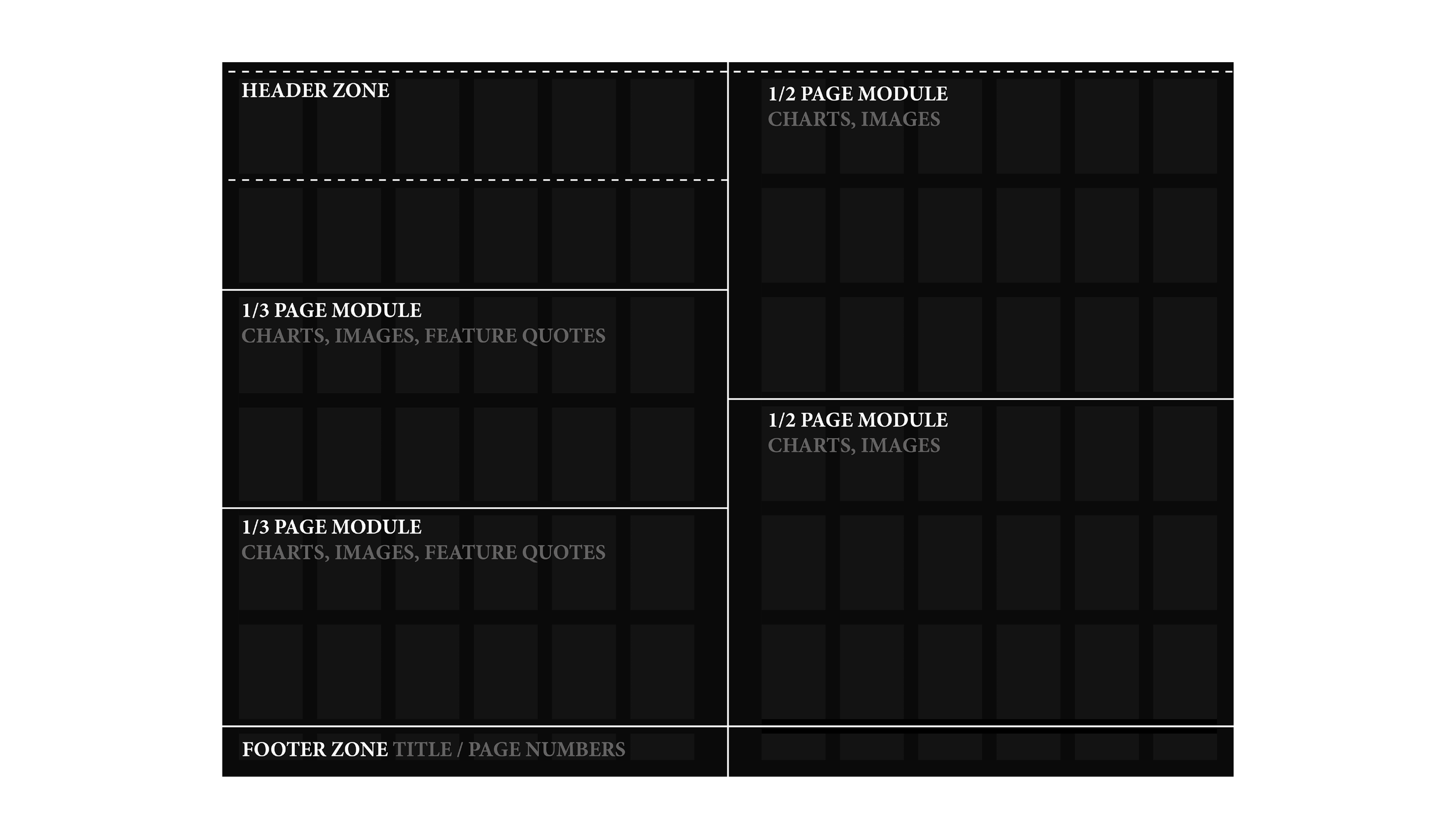
With the organisation already possessing a visual identity, including a main typeface and colour palette, much of the early part of the process was spent on building a flexible system of charts that could be very easily tailored to the statistics.
This diagram shows the spread being broken down into modules that could accommodate charts of different sizes, together with other layout elements.
2
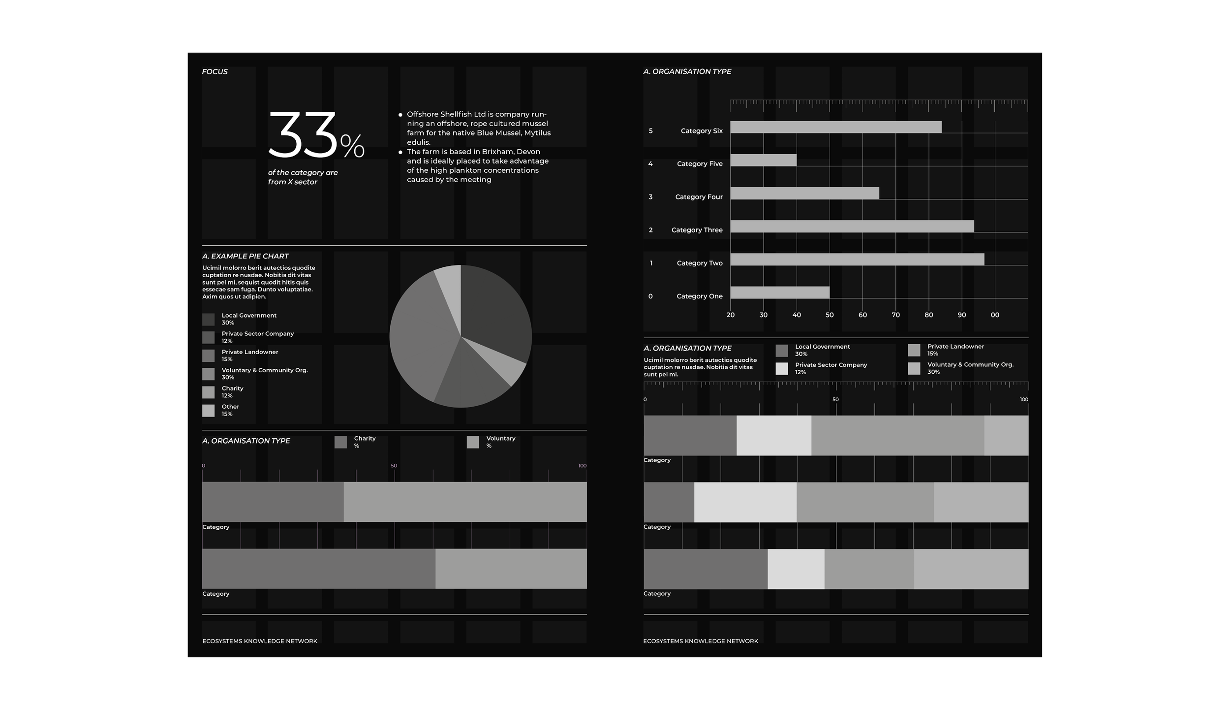
Here, a series of example chart options are applied to the modules. These are designed to be anchored to the underlying layout grid, so that designers working on future editions of the Report can easily copy and paste chart templates into the document.
A 100 percentage point scale is provided so that the proportional bar charts can be easily but precisely constricted in Indesign, before being hidden pre-publication.
Rather than using labels for pie charts, colour coded legends are stacked to the side. This minimises the amount of moving parts and reduces decision making.
3
A style guide document accompanies the Report template. It provides useful starting point chart configurations that can be copied and pasted in place. Similar examples are provided for text heavy pages, section dividers, case studies, and tables. A hierarchy of paragraph styles is also set up.

4
An accompanying image bank document was also created to provide consistency of image categories for specific use in different elements of the Report.

5A
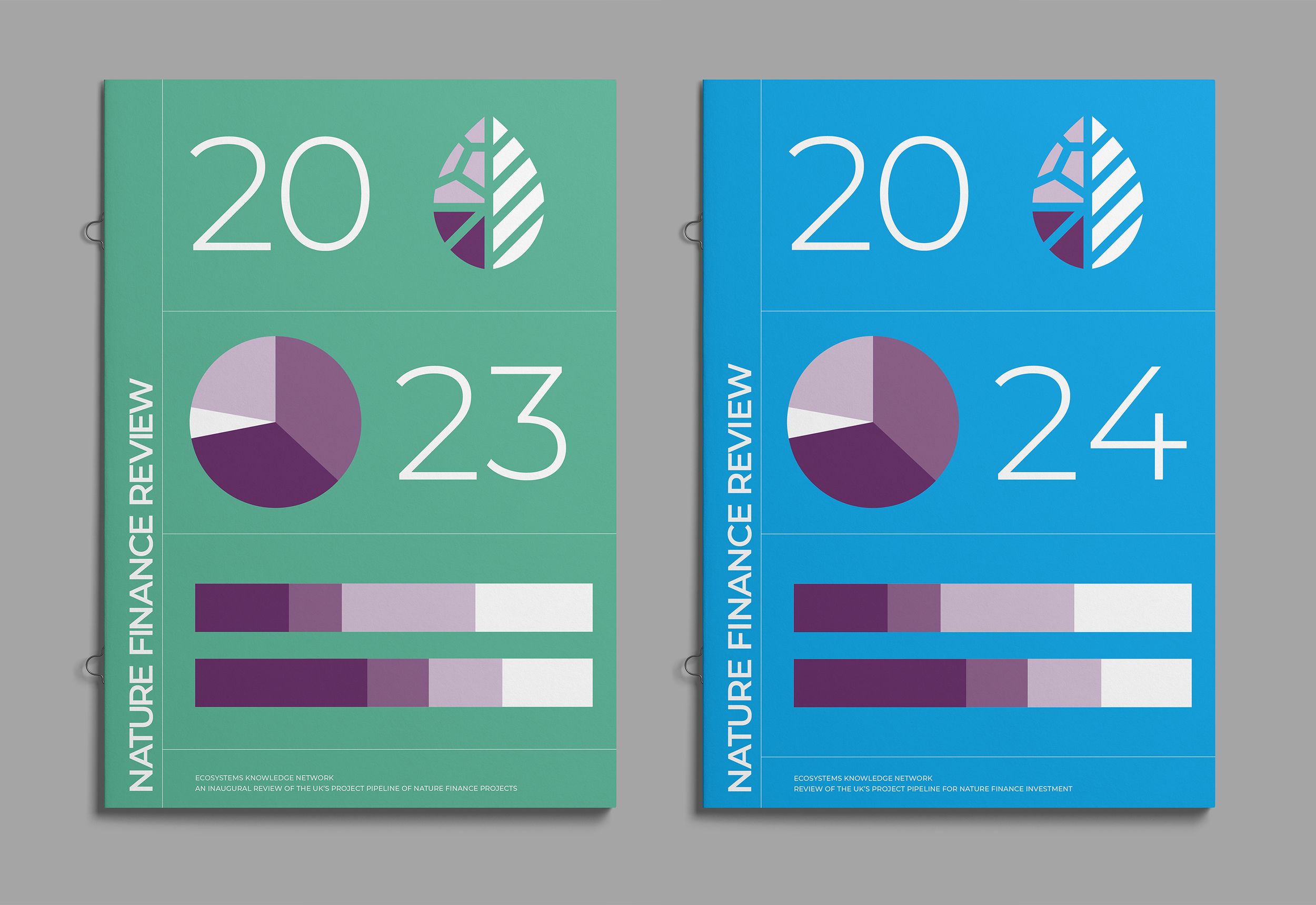
A selection of spreads from the 2023 Report, published in June.

5B
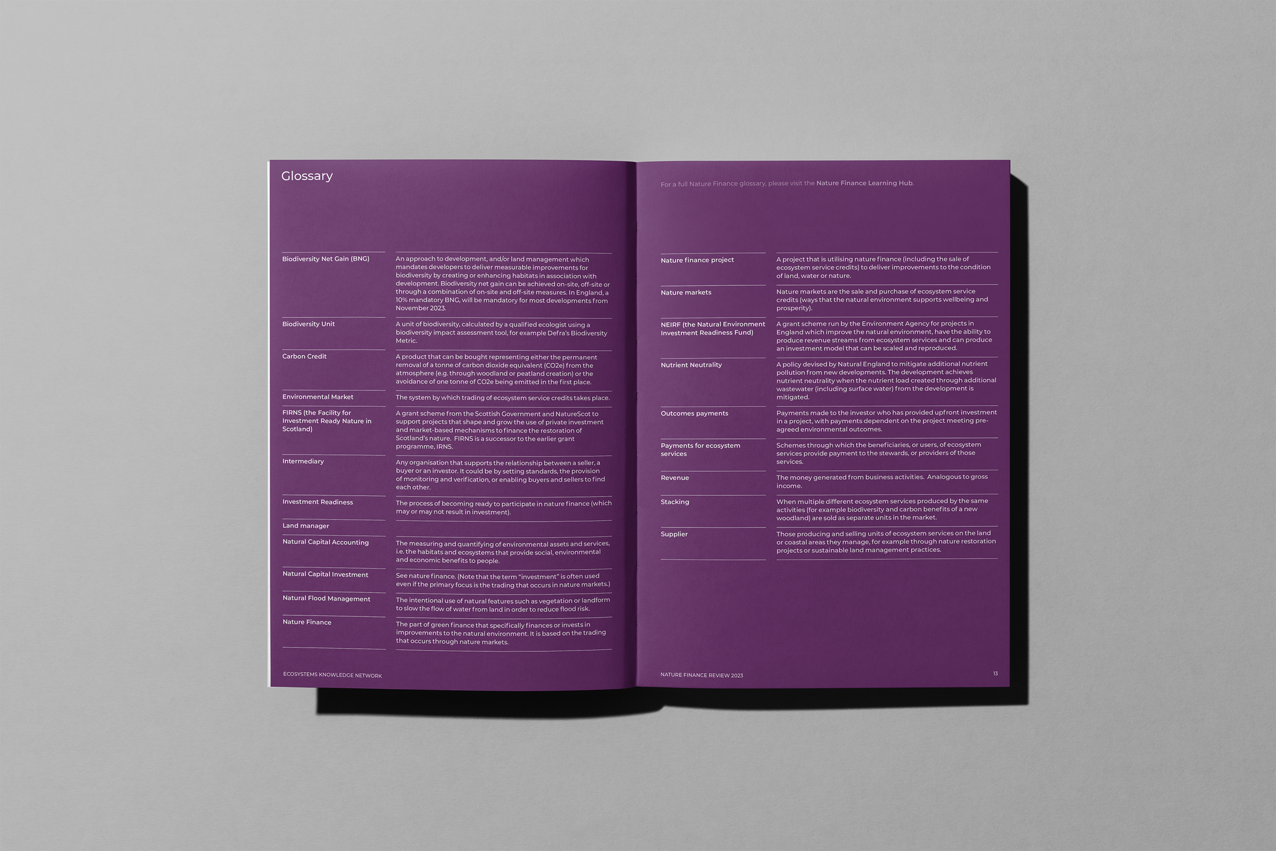
Report Glossary using the simple table format created for the publication.
5C
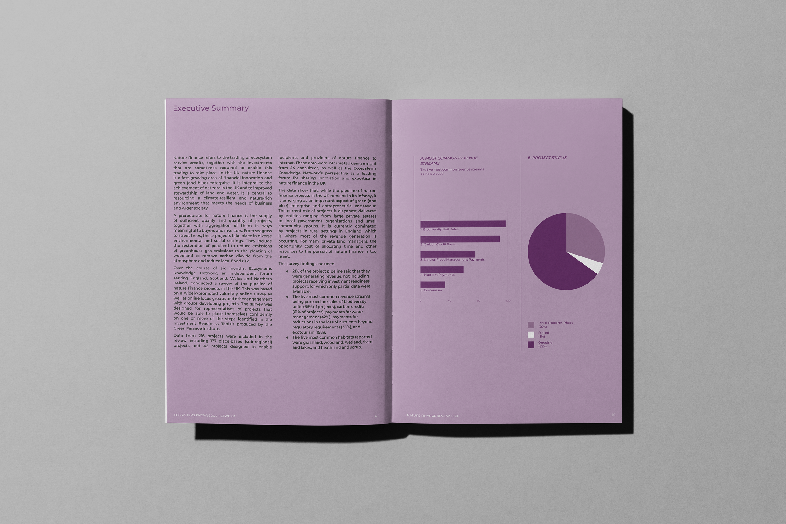
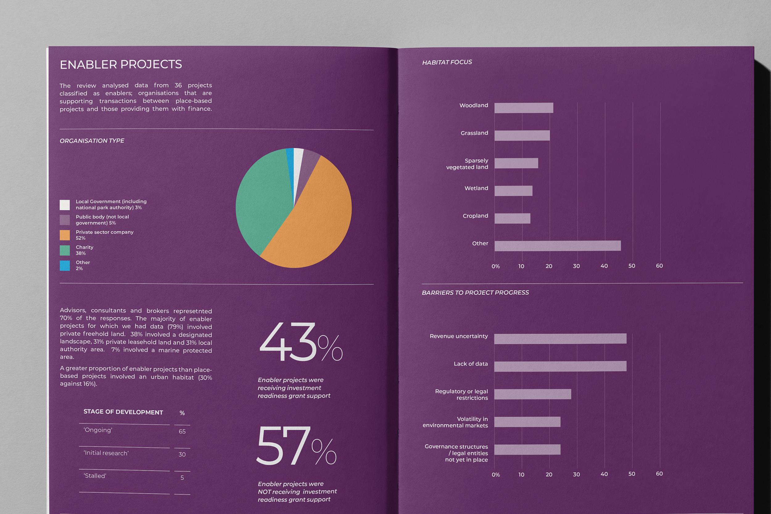
The exec summary introduces the three main chart styles used within the publication: a thin bar chart, a pie chart shown with the separate legend; and a bolder bar chart.
5D
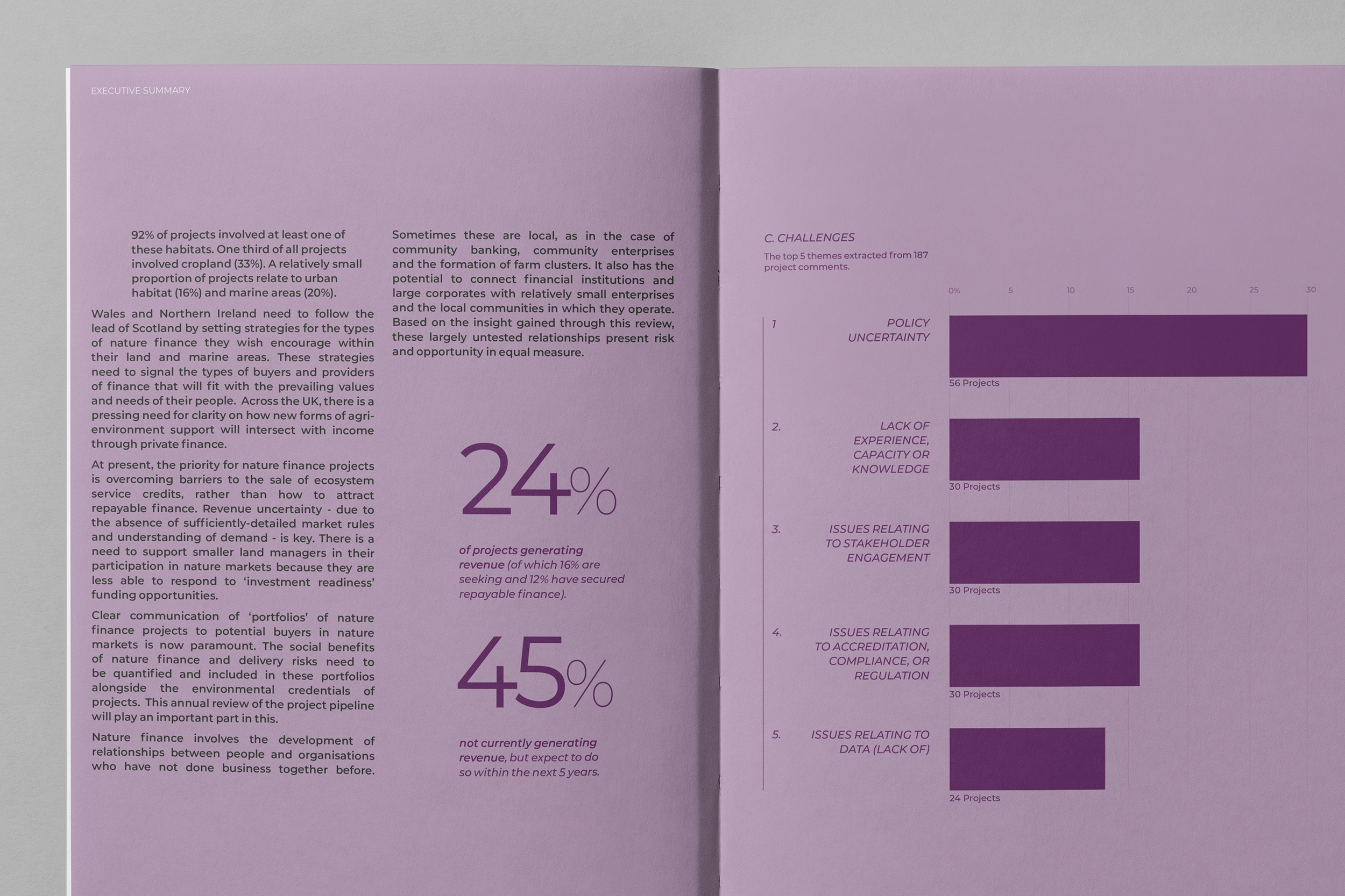
The Summary also introduces the numeric highlight statistics.
5E
Chapter dividers use a bank of aerial imagery of the UK, sourced from Unsplash. A separate InDesign document containing the images and pre-written captions/credits was provided to the client, for ease of reference and use.

5F
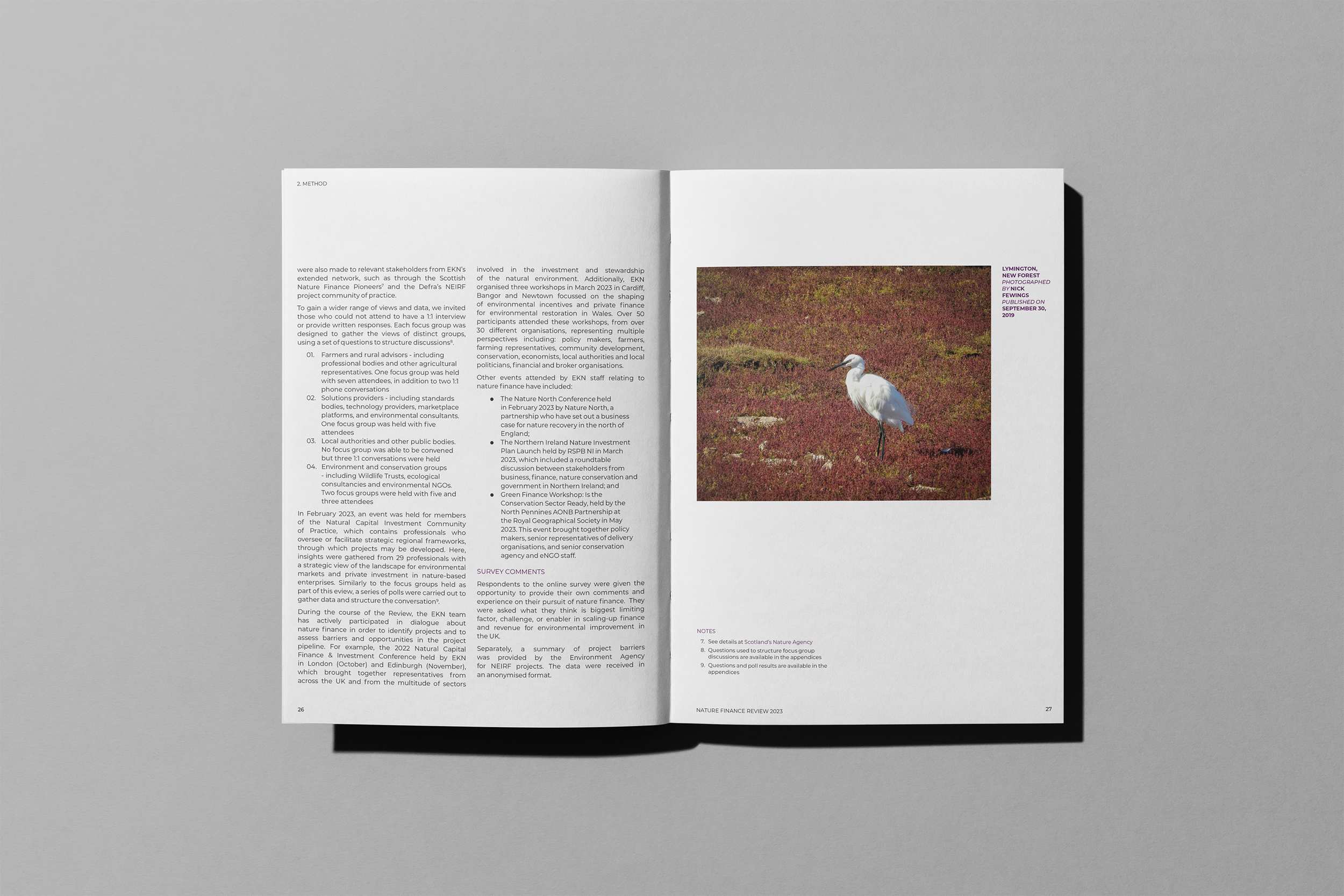
Similarly, the text heavy sections draw from a bank of nature imagery. Body copy needed to be large enough to readable on screen, but also suitable for a future print run.
5G
The majority of the infographic elements were realised as one of the three main chart types, with a small number being bespoke graphics, such as this map.

5H
Part of the challenge at the outset was devising the chart systems by working back from the maximum number of data categories that needed to be displayed. This spread shows the full 8 proportionate bars stacked. However, there was an alternate option to arrange up to 10 vertical bars of this scale across the 2-page spread.

5I
This spread shows some of the modular elements that fit into the page grid, including 1/3 page sections and 1/2 page sections.
5J
Another Chapter Divider with aerial photography.

5K
The core type hierarchy of pull-quotes, captions, body copy, footnotes, and running footers.

5L
The more text heavy sections have subtly different layout elements. For the Conclusions, the fine horizontal rules are used along with bolder subheadings. As shown in 5.F, the methodology section has a slightly different approach with rules omitted and smaller subheadings.

5M
Another spread from the conclusion.
